Using Shapes
The Content Designer allows you to add and customize vector shapes on the stage.
Adding a Shape
Section titled “Adding a Shape”- Click the + icon in the left panel or right-click on the stage
- Select Shape from the object menu
- A default square shape appears on the stage
Shape Types
Section titled “Shape Types”
All shapes start as a square. You can transform them into different forms:
| Shape | How to Create |
|---|---|
| Square | Default shape — no changes needed |
| Rectangle | Drag the side handles to stretch horizontally or vertically |
| Rounded rectangle | Set a corner radius in the Properties panel |
| Circle | Set a large enough corner radius to turn the square into a circle |
Customizing Shapes
Section titled “Customizing Shapes”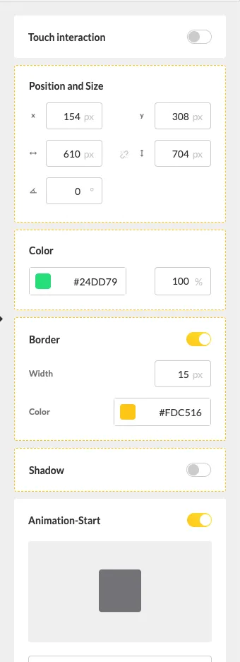
Use the Properties panel on the right side to configure:
- Size — Width and height in pixels
- Position — X and Y coordinates on the stage
- Corner radius — Adjust for rounded corners or to create circles
- Color — Fill color of the shape
- Rotation — Rotate the shape to any angle
Use Cases
Section titled “Use Cases”Shapes are useful for:
- Creating colored backgrounds or overlays
- Adding visual separators between content areas
- Building simple graphic elements without external tools
- Creating colored bars or banners behind text