viewneo Analytics
Collecting data is becoming an increasingly important to improve communication with users, customers, and employees. It provides an important way to measure and evaluate to make adjustments when needed. With the improvements in technology associated with the era of the Internet of Things and increased use of sensors, data can be captured more easily than ever before. However, in order to be able to use this data, you need the necessary tools to display and evaluate what you have recorded.
What is viewneo Analytics?
With viewneo Analytics, events of various types are stored and displayed in the Analytics Dashboard. Events are, for example, user actions such as touch events. Every time a user stands at a terminal and presses a button on a touch display, an event is triggered. These events are stored with viewneo Analytics and graphically displayed on the dashboard.

In addition to touch events, there are also events triggered by viewneo® Butler (motion detector, physical switch, RFID sensor) or viewneo® Face Recognition (camera face detection).
Some examples of events are:
- Touching and interacting with a display (touching a button on a display with touch / multi-touch function)
- Pressing a ZigBee button (viewneo Butler)
- Motion sensor (viewneo Butler) reports movement
- Ulraschall Sensor (viewneo Butler) reports distance to the object less than X meters
- RFID sensor (viewneo butler) reports if a chip is present or absent (for example, product removed from shelf)
- Face Recognition (viewneo FR-Cam / FR = Face Recognition)
- Playing content (viewneo Player)
Note: In principle, any device (such as Philips Hue motion detector) which is connected to the viewneo Butler can trigger an event, that can later be captured and evaluated. You can find more information in the viewneo Butler section.
Analytics Dashboard
The Analytics Dashboard can be reached by clicking on the Analytics icon.
![]()
Dashboard data refers to a device or device group. If you want to display the data of a specific device or a specific device group, then you will need to select this device or device group from the list of devices/device groups, located on the left.
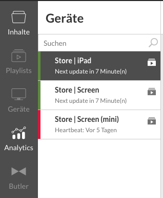
Once a device has been selected, the data of the events that came from that device will be displayed in the dashboard.
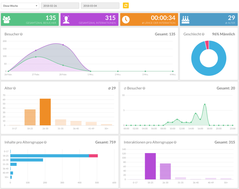
Filtering the time
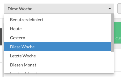
By default, the data of the current week is always displayed first. To view data for a specific period of time, just select the appropriate data range from the top of the dashboard.

Summary of the most important KPIs (Executive Summary)
In the upper part, there is a summary of the most important data from the previously defined time range.

Interpretation of the data
| Title | Representation/Icon | Meaning |
|---|---|---|
| Total number of visitors |  |
How many visitors were counted during the selected period? (Eg by facial recognition, camera) |
| Total number of interactions |  |
How often have visitors interacted at the terminal or kiosk? |
| Ø-Duration of interactions |  |
How long on average has a visitor interacted with the system? The period between the first and last interaction is measured. |
| Ø-Age |  |
How old were the visitors (average within the given period). |
Number of visitors and timeline interactions
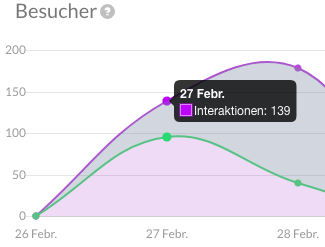
This chart displays the number of visits and the number of actions performed by the visitors. The data is distributed over the time of the selected period.
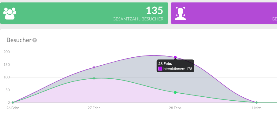
Tip: By mousing over the diagrams you can set the value at a selected point.
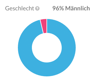
Statistics on the gender distribution of visitors
This graph displays the gender distribution of visitors over the observed time period. This data is important in ensuring that content is aligned with the audience viewing it.
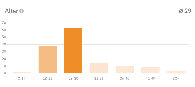
Statistics on the age distribution of visitors
This graph plots the distribution of the age of visitors over the observed period. Like gender distribution, age distribution data is important to better target and optimize content for visitors.
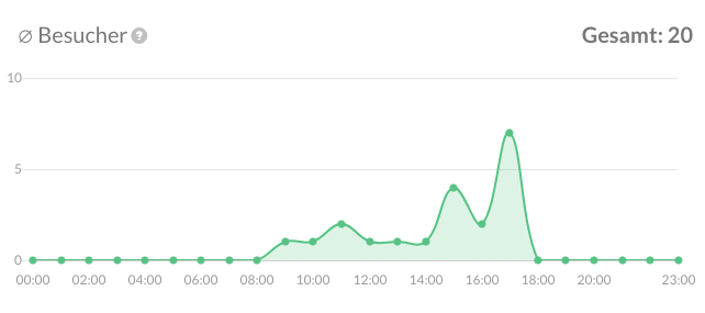
Number of average visitors and per hour
This diagram shows how the daily streams of visitors are distributed over time. This helps to pinpoint at which times of the day are visitors viewing and interacting with your content. This data can be used to tailor content to the expected flow of visitors.
Displayed content by age group and gender (activity)
This diagram shows how many contents of which target group were shown. The visitors are grouped by age and gender.
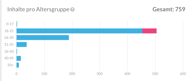
Behavior of the respective age groups (activity)
This metric shows how active which age groups were at the terminal by showing how much content they viewed or how many interactions were made per visitor. The greater the content viewed or accessed, than the greater the overall activity measured.
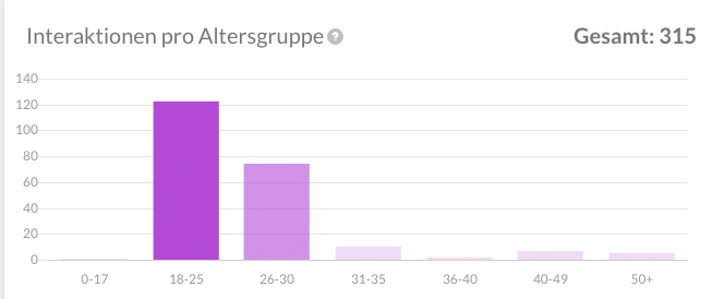
Suggestion: As different age groups deal very differently with the content at terminals, this data can be used to measure how content changes affect the activity of each age group.